the continental wok
a cloud kitchen built for busy days, tight budgets and meals that actually feel good.
00

problem
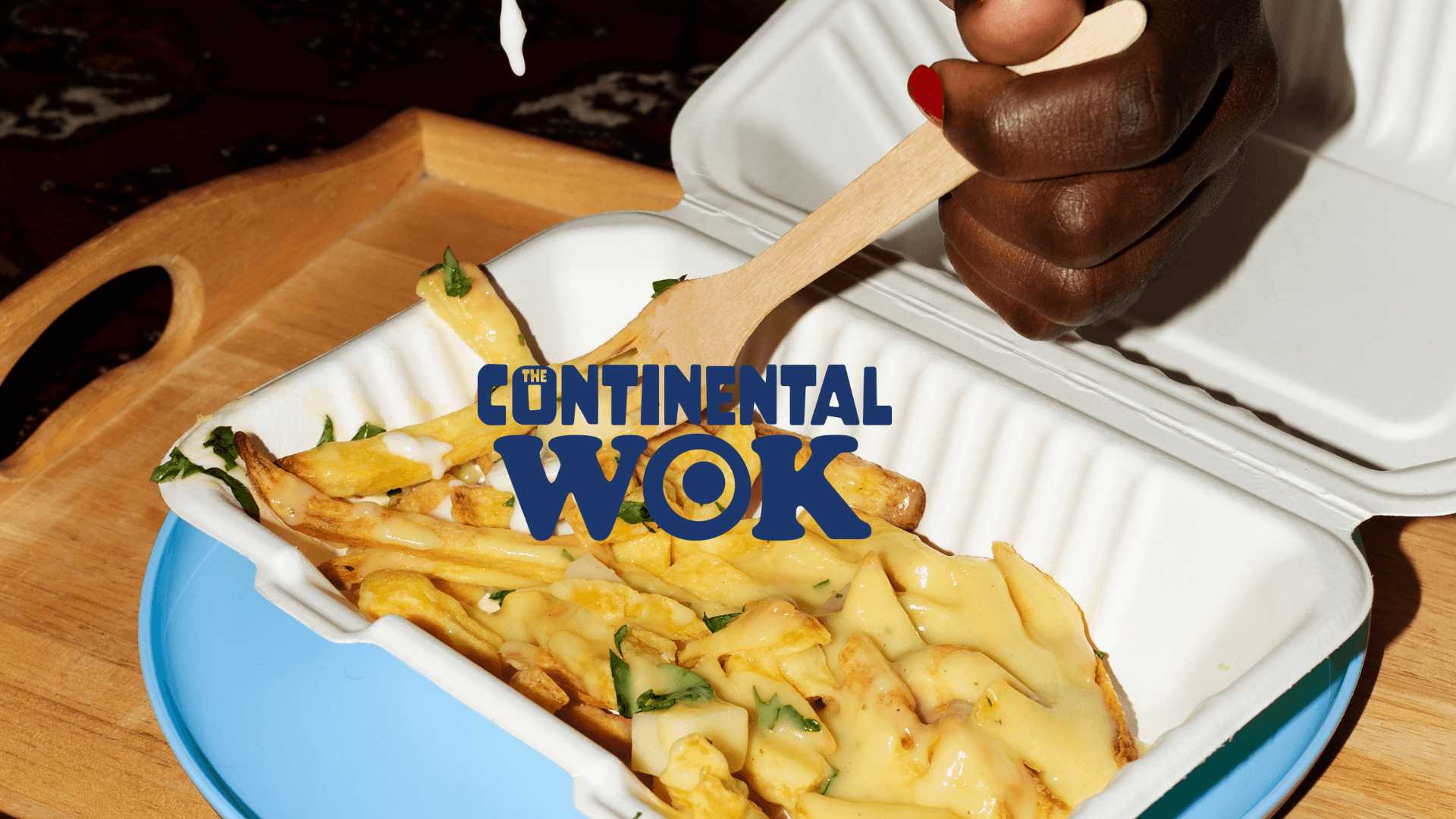
in a crowded cloud-kitchen market where every brand was trying to out-shout the next with loud colours, glossy graphics and over-the-top branding, the client had a different ambition. they wanted to stand out by going quieter, faster and more thoughtful. their offering was simple: quick, pocket-friendly meal bowls that were healthy, fresh and customisable to each customer’s preference. they needed a brand identity that matched this promise without getting lost in the noise. and they needed someone to build it from the ground up.
solution
the brand launched with an identity that cut through the chaos by not participating in it. customers associated the visuals with freshness, speed and honesty. the stork became a memorable mascot. the izakaya-inspired system helped the brand feel grounded instead of gimmicky. and in a market fighting for attention, they earned it by being the only one not trying too hard.
we realised early on that competing with the existing visual landscape was pointless. everyone was playing the same game: shiny food shots, neon palettes, heavy gradients. so we chose the opposite direction. instead of amplifying the noise, we stripped everything back.
we drew inspiration from traditional izakaya culture. not for the aesthetic alone, but for the values behind it. quick service, fresh ingredients, uncomplicated food, and an atmosphere that feels warm without trying too hard. this gave us a visual and tonal foundation that felt different from anything else in the space.
we built the brand’s visual system around this idea. muted tones. hand-drawn strokes. textures that felt tactile and lived-in. typography that echoed the casual, no-frills nature of japanese street-side eateries. it created an identity that felt both familiar and fresh, without leaning on clichés.
the mascot came next. we introduced a stork—playful, light and symbolic. instead of the usual “fast delivery” clichés, the stork became our narrative anchor, representing how the brand delivers “the food babies” to customers. it added charm without being childish, and gave the brand a recognisable character that tied the entire system together.
once the identity was set, we translated it into social. every post carried the same intent: simple, fresh, fast. no screaming promotions. no clutter. just clear messaging, tight design and a tone that felt confident in being understated.
01

02

03

04

05

see also


